Shading between two lines – ggplot

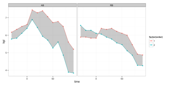
First one to say geom_ribbon loses. I was plotting some data for a colleague, had two lines (repeated experiment) per person (time on the x axis) facetted by id, I thought it’d be nice to shade the area between the two lines so that when they were deviating you’d see a large shaded area, and when they were close there would be little shading, just to aid the visual of the separation between repeats. I thought this would be trival, and geom_ribbon would do the trick, alas, some of the lines crossed so that didn’t pan out. Ignoring the ‘experiment/order’ variable and reordering the data to track the max and min values at each time point doesn’t work, because when they cross you end up with a box around the cross, rather the inside region being shaded.

I did think this would have been done before, but I couldn’t find anything that resuable. There was this blog post but like user Aniko mentioned in the comments, that was essentially finding the midpoints by hand, which seemed a bit clumsy (not saying the below is any better). Aniko’s solution used a package gpclib to create polygons for each block of colour, which was about where I got to when looking for a ggplot strategy. I played around a bit and couldn’t get the gpc.poly data to work with ggplot, so put together a couple of small functions to essentially do the same thing.

So here’s the code and output.

# load data
library(ggplot2)
library(RCurl)
library(gridExtra)
library(plyr)
theme_set(theme_bw())

dat <-read.csv(textConnection(getURL("https://raw.githubusercontent.com/nzcoops/datasets/master/shading_two_lines")))
h(dat)
##   id order time  bgl
## 1 AB     1  -30 6.17
## 2 AB     1  -20 6.33
## 3 AB     1  -10 6.50
## 4 AB     1    0 6.61
## 5 AB     1   10 7.44
## 6 AB     1   20 7.28

# this block is run within each person essentially it creates a duplicate of
# all rows bar the first and last two and adds a grouping variable to the
# end that way every 4 rows are will be the coords for a polygon

mperson <-function(x) {
    x <-x[order(x$time), ]
    y <-x[-c(1, 2, nrow(x) -1, nrow(x)), ]
    x <-rbind(x, y)
    x <-x[order(x$time), ]
    x$group <-rep(letters[1:(nrow(x)/4)], each = 4)
    return(x)
}
dat2 <-ddply(dat, .(id), mperson)
h(dat2)
##   id order time  bgl group
## 1 AB     1  -30 6.17     a
## 2 AB     2  -30 5.78     a
## 3 AB     1  -20 6.33     a
## 4 AB     2  -20 5.83     a
## 5 AB     1  -20 6.33     b
## 6 AB     2  -20 5.83     b

# this block is run within each person and 'block (group)' of 4 rows (each
# polygon) essentially this is to get the rows in the correct order, so that
# the geom_polygon function can work clockwise to construct the polygons the
# correct way
mgroup <-function(x) {
    x <-x[order(x$bgl), ]
    left <-x[x$time ==min(x$time), ]
    right <-x[x$time ==max(x$time), ]
    if (all(left$order ==right$order)) {
        left <-left[order(left$bgl, decreasing = T), ]
        right <-right[order(right$bgl, decreasing = F), ]
        return(rbind(left, right))
    } else {
        return(x[order(x$time), ])
    }
}
dat2 <-ddply(dat2, .(id, group), mgroup)
h(dat2)
##   id order time  bgl group
## 1 AB     1  -30 6.17     a
## 2 AB     2  -30 5.78     a
## 3 AB     2  -20 5.83     a
## 4 AB     1  -20 6.33     a
## 5 AB     1  -20 6.33     b
## 6 AB     2  -20 5.83     b

And here’s the plot

ggplot(dat, aes(x = time, y = bgl, group = order)) +geom_line(aes(colour = factor(order))) +
geom_point(aes(colour = factor(order))) +geom_polygon(data = dat2, aes(y = bgl, 
    group = group), alpha = 0.3) +facet_wrap(~id)
shading_plot1

I wrote this post in RStudio using the R Markdown language and then knitr to turn in into markdown (.md), and then pandoc to turn it into html. The original file is available here on github.

system(“pandoc -s shading_between_the_lines.md -o shading_between_the_lines.html”)

As an aside, the mgroup function might seem like overkill, but it was a bit tricky, as when the lines cross you have to be careful to get the right ‘hourglass’ orientation, either vertical or horizontal.

dat <-data.frame(x = c(10, 10, 20, 20), y = c(3, 4, 5, 2), order = c(1, 2, 
    1, 2))

a <-ggplot(dat, aes(x = x, y = y)) +geom_line(aes(group = order)) +geom_point(aes(group = order)) +
geom_polygon(aes(x = x, y = y), fill = "red", alpha = 0.2)

dat <-data.frame(x = c(10, 10, 20, 20), y = c(3, 4, 2, 5), order = c(1, 2, 
    1, 2))

b <-ggplot(dat, aes(x = x, y = y)) +geom_line(aes(group = order)) +geom_point(aes(group = order)) +
geom_polygon(aes(x = x, y = y), fill = "red", alpha = 0.2)

dat <-data.frame(x = c(10, 20, 10, 20), y = c(3, 4, 5, 2), order = c(1, 2, 
    2, 1))

c <-ggplot(dat, aes(x = x, y = y)) +geom_line(aes(group = order)) +geom_point(aes(group = order)) +
geom_polygon(aes(x = x, y = y), fill = "red", alpha = 0.2)
grid.arrange(a, b, c, nrow = 1)
shading_plot2


Finding the midpoint when creating intervals

Nothing ground breaking here. I was doing some work dividing data into deciles and then creating some plots. I couldn’t find an function to calculate this from cut, and I use cut quite a bit. So here we are.

midpoints <- function(x, dp=2){
lower <- as.numeric(gsub(“,.*”,””,gsub(“\\(|\\[|\\)|\\]”,””, x)))
upper <- as.numeric(gsub(“.*,”,””,gsub(“\\(|\\[|\\)|\\]”,””, x)))
return(round(lower+(upper-lower)/2, dp))
}


And in an example:

midpoints <- function(x, dp=2){
lower <- as.numeric(gsub(“,.*”,””,gsub(“\\(|\\[|\\)|\\]”,””, x)))
upper <- as.numeric(gsub(“.*,”,””,gsub(“\\(|\\[|\\)|\\]”,””, x)))
return(round(lower+(upper-lower)/2, dp))
}
mtcars$mpg
cut(mtcars$mpg, quantile(mtcars$mpg), include.lowest=T)
midpoints(cut(mtcars$mpg, quantile(mtcars$mpg), include.lowest=T))

Which looks like this:

> midpoints <- function(x, dp=2){
+   lower <- as.numeric(gsub(“,.*”,””,gsub(“\\(|\\[|\\)|\\]”,””, x)))
+   upper <- as.numeric(gsub(“.*,”,””,gsub(“\\(|\\[|\\)|\\]”,””, x)))
+   return(round(lower+(upper-lower)/2, dp))
+ }
>
> mtcars$mpg
[1] 21.0 21.0 22.8 21.4 18.7 18.1 14.3 24.4 22.8 19.2 17.8 16.4 17.3 15.2 10.4 10.4 14.7
[18] 32.4 30.4 33.9 21.5 15.5 15.2 13.3 19.2 27.3 26.0 30.4 15.8 19.7 15.0 21.4
> cut(mtcars$mpg, quantile(mtcars$mpg), include.lowest=T)
[1] (19.2,22.8] (19.2,22.8] (19.2,22.8] (19.2,22.8] (15.4,19.2] (15.4,19.2] [10.4,15.4]
[8] (22.8,33.9] (19.2,22.8] (15.4,19.2] (15.4,19.2] (15.4,19.2] (15.4,19.2] [10.4,15.4]
[15] [10.4,15.4] [10.4,15.4] [10.4,15.4] (22.8,33.9] (22.8,33.9] (22.8,33.9] (19.2,22.8]
[22] (15.4,19.2] [10.4,15.4] [10.4,15.4] (15.4,19.2] (22.8,33.9] (22.8,33.9] (22.8,33.9]
[29] (15.4,19.2] (19.2,22.8] [10.4,15.4] (19.2,22.8]
Levels: [10.4,15.4] (15.4,19.2] (19.2,22.8] (22.8,33.9]
> midpoints(cut(mtcars$mpg, quantile(mtcars$mpg), include.lowest=T))
[1] 21.00 21.00 21.00 21.00 17.30 17.30 12.90 28.35 21.00 17.30 17.30 17.30 17.30 12.90
[15] 12.90 12.90 12.90 28.35 28.35 28.35 21.00 17.30 12.90 12.90 17.30 28.35 28.35 28.35
[29] 17.30 21.00 12.90 21.00

ggplot + powerpoint = wall + head … solution?

Confession, by ‘solution?’ I literally mean I’m asking for your thoughts on a solution.

Like it or lump it I do a lot of graphs for presentations, largely in powerpoint. That’s the way my colleagues/industry work(s) and it’s not about to change anytime soon. I have a real frustration with getting my plots out and into powerpoint.

What am I after?

A good workflow for exporting plots, the same dimensions each time, so that tick mark text, axis labels etc are readable and the plots are nice and sharp. I want the plot to take up about 75% of the slide (so leaving enough room for a heading). I want to be able to drag and drop the plots from a folder onto the slide.

What have I done in the past?

Numerous different things. Sometimes if it’s got to be done quick I’ll use the export in Rstudio and quickly resize. Or I’ll zoom in on Rstudio (resizing) and take a screenshot (v easy with a mac but the naming is naff). Or I’ll export them using a function and then resize within powerpoint. But THAT is what I am trying to avoid (well, perfect). Why, because it’s a pain. Because it’s inconsistent. If I am changing slides from a plot of males to a plot of females, I want the plot to be the EXACT same size sitting in the exact same spot on the next slide. Nothing irritates me more than plots bouncing around from slide to slide. And this is difficult and time consuming to do and get right within ppt.

Where am I up to with a workflow?

This is where I’m hoping someone can set me on the straight and narrow. I’m looking at ggsave and png/dev.off as two options. What works well on the slide is a png that is about 400×400 pixels . This is 5.56×5.56 inches or 14.11×14.11cm at 72 dpi. That drops nicely on a slide leaving enough room for a heading.

With ggsave you can’t specify size in pixels(?), hence providing the values in the other units.

Where I have hit a wall is the ratio of text to plot size. ggsave seems to have things nice and sharp, but altering ‘scale’ or ‘dpi’ (no surprises based on their intention) changes the actual ‘size on the slide’ of the plot, given that ppt has to show it at 72 dpi. The problem with ggsave is that with w/h 14.11cm and dpi 72 then the size is right but it’s not sharp. png/dev.off has the same problem. When I set w/h to 14.11cm and dpi to 300 the actual image (when at 72 dpi) is ~55cm. And powerpoint has to display it at 72 dpi, so it blows off the page.

What does kinda work?

If I create an image using ggsave w/h 14.11cm and dpi 300, open it in preview on the mac, it says that at 72 dpi it is ~55cm, I can then resize it down to 14.11cm (with the ‘resample image’ option UNchecked), I then get an image that is 14.11cm that is nice and sharp and drops into powerpoint nicely.

Question!

Is there a way to get R to resample the image on the way out? Is there a better way to do this (has to be!)? Would creating a theme where everything is smaller benefit the situation (I tend to think not).

I feel like I’m going about this all the wrong way. But, given that the ‘what does kinda work?’ above actually does get a nice sharp plot to just drag and drop onto the page, that means it is possible and it’s just about the workflow right, right?

Updated age calculation function

I had previously posted a function for calculating age with two dates. This was for the whole number ‘age’ where we are assuming you don’t want someone to be recorded as ’18’ until their 18th birthday (so more than just YEAR – YEAR).

There was an error in the code when a certain combination was entered, so I’ve rewritten it, and this combination (with leap years) is now working correctly.

Code is available here: https://raw.github.com/nzcoops/r-code/master/age_function.R

require(RCurl)

source(textConnection(getURL(“https://raw.github.com/nzcoops/r-code/master/age_function.R&#8221;)))

dob <- as.Date(“2000-02-29”)

dov <- as.Date(“2004-02-28”)

age_years(dob, dov)

dob <- as.Date(“2000-02-29”)

dov <- as.Date(“2004-02-29”)

age_years(dob, dov)

dob <- as.Date(“2000-02-29”)

dov <- as.Date(“2004-03-01”)

age_years(dob, dov)

Returns

> dob <- as.Date(“2000-02-29”)
> dov <- as.Date(“2004-02-28”)
> age_years(dob, dov)
[1] 3
> dob <- as.Date(“2000-02-29”)
> dov <- as.Date(“2004-02-29”)
> age_years(dob, dov)
[1] 4
> dob <- as.Date(“2000-02-29”)
> dov <- as.Date(“2004-03-01”)
> age_years(dob, dov)
[1] 4


ggplot graphs in publications?

The grey background and/or default choice of colours for groups makes a ggplot graph stand out to any R user when seen in a presentation. But ggplot graphs get all ninja when it comes to publications, either that or not a lot of graphs generated using ggplot have been published in the journal I read (health research (epidemiology/diabetes largely). Like many others ggplot is my go to graphing package and I’ve prepared graphs using ggplot that have been published in the past.

Continue reading

Popularity indicator, with images (NFL)

It’s Friday night, there’s nothing good on TV, mmm conditions are perfect for shaggin about in R. So I’m an NFL fan, and (shameless plug) avid fan of this NFL podcast. They run their own pickem league which unless users opt out shows their tips in a table. You can eyeball it and get a feel for who picked what, but naturally I wasn’t too fond of just eyeballing the data. So that was my Friday night motivator for this project. At work (among other things) I’m working on using knitr to automate some reports for live reporting of uploaded data, I thought (potentially when polished) the NFL Rants and Raves site could could use this on their pickem site.

Continue reading

Simple plot with text boxes

Was doing a little presentation to our research group and had to explain the difficulties of ‘collapsing’ longitudinal data into a single measure when the Y var is quite variable. For the particular Y var of interest, it represents burden of disease, so a high Y var for a long time is indicative of high risk, compared to a low value for a similar time. Hence you have issues using with the mean, or the AUC. There’s a lot more to it than that, but that’s the gist of the point of this graph. Sharing the code cause it might be useful to someone else at some point.

Continue reading

(Manually) making letters with geom_path() – fun example

Disclaimer, maybe the title should be ‘lame example’.

Nothing overly exciting here. Just posting cause it took a little faffing about and someone else might like the idea. At my work (research institute) we (the social club committee) were organising an ‘Olympics event’ with a bunch of task for teams of 4, with a loose research theme. I thought a graphing race could work, and was trying think how it could be made a little more fun than drawing a line.

Continue reading

Petrol prices adjusted for inflation

Petrol prices adjusted for inflation (Perth, Western Australia)

The thought for this sprung to mind when I saw petrol drop below $1.20 per litre the other day, and it made me think, I remember paying that when I got to Australia 4.5 years ago. Fuel prices are listed online here, so I went to the site for a nosey at their archiving and they have a reasonably comprehensive archive of data – WA historic fuel prices. All that was left to do was hunt out the inflation (CPI) data, which was also readily available – Australian inflation data.

The fuel price data was available as a monthly average [for the Perth Metro area]. The inflation data was available quaterly. Given the fuel data started in 2001, I thought it made sense to show things in 2001 dollars, so I divided the indices by the 2001 indices to make this the baseline. For manipulation purposes I converted the month data into date data, using the 1st of the month for the day in all cases. Then the ‘closest’ inflation index was merged onto the fuel price, which was then converted into 2001 dollars, and graphed.

Continue reading